A Mark That Works Before Anyone Reads the Copy
Logos fail when they're designed to look good. Ours are designed to work - tested against 12 criteria before anything ships.
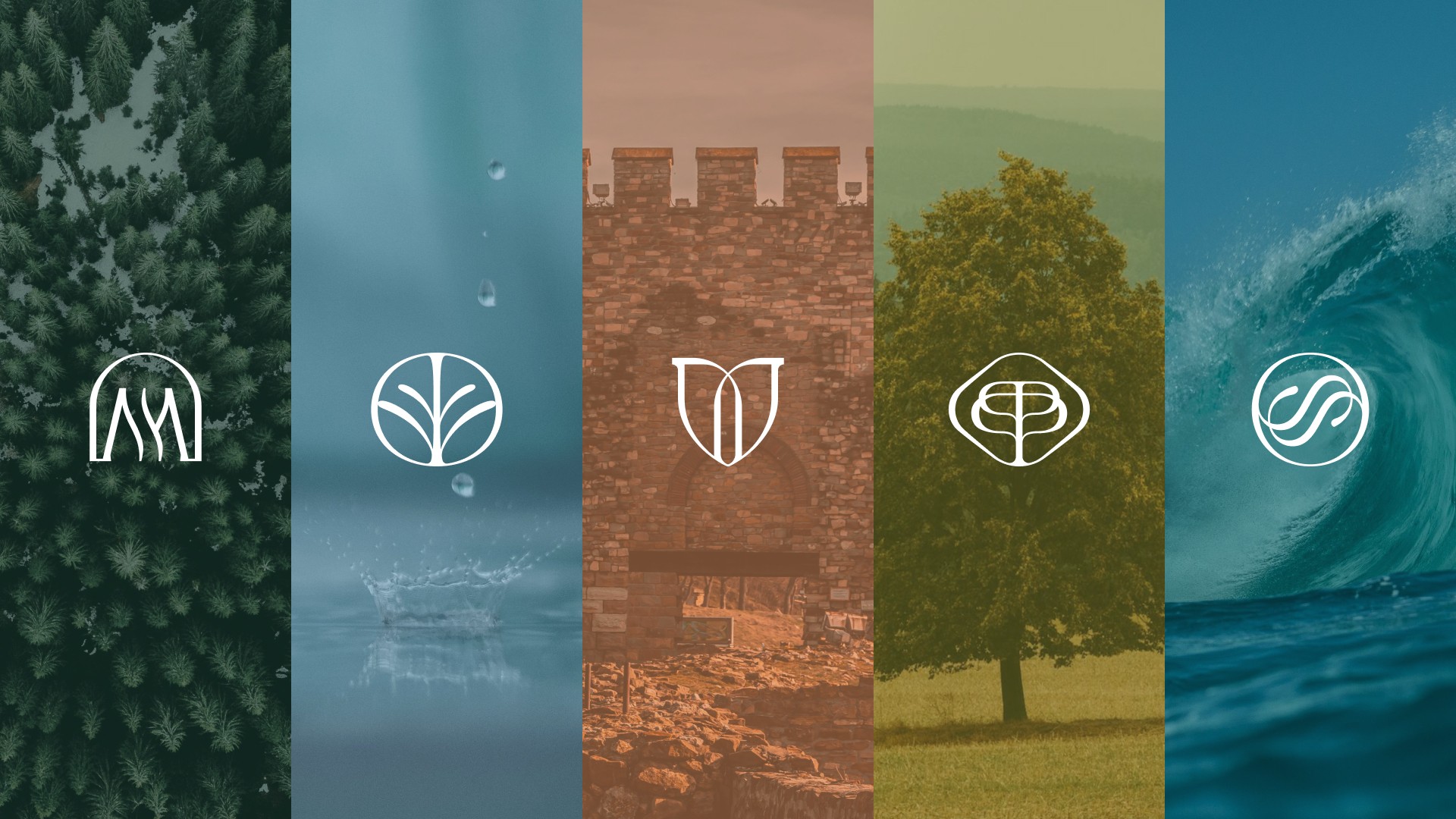


Logos fail for one reason: they're designed to look good instead of designed to work. A logo has to function at 16px in a browser favicon, at three meters on a conference backdrop, and in black ink on a legal document. It has to survive bad printing, low-resolution screens, and embroidery on a jacket. Most logos tested against those conditions fail. We test every logo before it leaves the studio against 12 specific criteria. If it doesn't pass, it doesn't ship.
Why It Matters
Your logo is the first trust signal your brand sends. Before a prospect reads your headline, before they see your pricing, before they talk to anyone on your team, they've already made a judgment based on your mark. That judgment takes less than a second. It compounds every time they see the logo again, positively or negatively.
A strong logo doesn't just look good. It signals competence, category, and character simultaneously. It reduces the cognitive load your audience carries every time they encounter your brand. Over 300 projects, the pattern is consistent: brands with rigorous marks outperform brands with pretty marks. The difference is whether the design started from aesthetics or from the conditions the mark actually has to survive.
--NE
What You Get
Brand Discovery Brief - context, audience, competitive landscape, use-case requirements, and the strategic territory the mark must occupy
3 Distinct Logo Directions - each with a written rationale explaining the strategic logic, not just the aesthetic choice
12-Criteria Test Results - documented pass/fail for every direction: favicon, monochrome, blur, invert, scale, contrast, color reversal, texture application, embroidery, stamp, dark/light background, context
Full Logo System - primary mark, wordmark, symbol, horizontal and vertical lockups, and responsive variants
Color Specifications - primary and secondary colorways with hex, RGB, CMYK, and Pantone references
Clear Space and Sizing Rules - minimum sizes, clear space requirements, and approved background combinations
Master File Pack - SVG, PDF, EPS, PNG in every configuration and background combination
Usage Documentation - one-page quick reference for the team covering approved uses, prohibited uses, and common mistakes
:)
Our Typical Process
Related projects
Transforming Bulgaria’s first hotel chain
Sharlopov Hotels, the first private hotel chain in Bulgaria, is taking a significant step forward, introducing a new brand identity, updated websites and a modernized vision for each of its hotels.
Sharlopov Hotels
2024-2025
Redefining A/B testing for optimal business returns
Enabling data-driven product teams with robust analytics tools
Analytics Toolkit
2021
A Fresh Look at Contact Lenses
How KICKFLIP crafted a vibrant identity and digital-first experience for the next generation of eyewear.
MONOYER
2022
Reaching ideal customers with AI
A seamless and unified brand identity that embodies leadmonitor's ingenuity and exceptional performance, establishing them as a frontrunner in their industry.
Leadmonitor AI
2022
Why KICKFLIP?
13+ years, 300+ brand projects, logos for hotel groups, SaaS startups, wellness platforms, fintech ventures, and AI companies (including our own). The 12-criteria testing protocol was built from watching logos fail in the real world and working backward to what the test should have caught. No logo leaves this studio untested. That's not a quality claim. It's a process.
Hear It From Our Partners
--SE
Got Any Questions?
01.
Question
Answer
01.
Question
Answer
01.
Question
Answer
01.
Question
Answer
Services