WeShipCars operates in one of the most competitive and trust-sensitive industries: auto transport. Customers typically arrive stressed, time-constrained, and uncertain, often navigating major life transitions such as relocations, military moves, online car purchases, or seasonal travel. In a market dominated by unclear pricing, посредници, and poor communication, trust is not a nice-to-have, it is the deciding factor.
We partnered with WeShipCars to help them redefine how auto transport is perceived and experienced. The goal was not only to redesign their visual identity and website, but to build a clear strategic foundation that could support long-term growth, improve customer confidence, and position the brand as a modern, customer-first leader in the industry.
Type of work
Year
2024
Timeframe
1 month
Industry
Logistics / Automotive
Strategy & Discovery
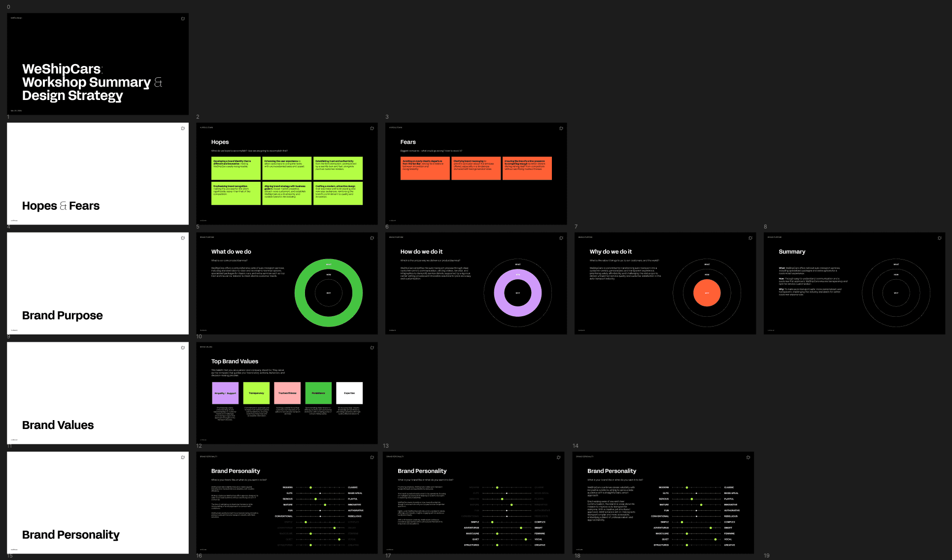
The project began with a deep discovery phase, including a kickoff workshop, detailed personas, competitive analysis, and opportunity assessment. The objective was to understand the business from the inside out before making any visual or structural decisions.
Brand Positioning & Audiences
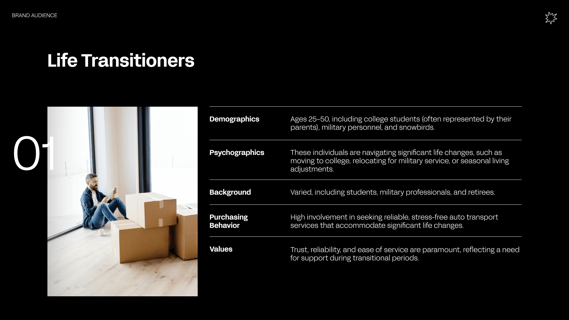
WeShipCars serves multiple audiences, each with different motivations, emotional states, and expectations. These include students and parents navigating college moves, military personnel managing PCS relocations, retirees and collectors transporting high-value vehicles, online car buyers, business clients, and niche markets such as Hawaii, Alaska, and Puerto Rico.
Across all segments, several shared drivers emerged: the need for trust, clarity, responsiveness, and a sense of control during an otherwise stressful process. The brand was positioned to feel professional and reliable, but also empathetic, vocal, and approachable.
The resulting brand personality blends classic reliability with modern efficiency, balancing structure with innovation and clarity with confidence.
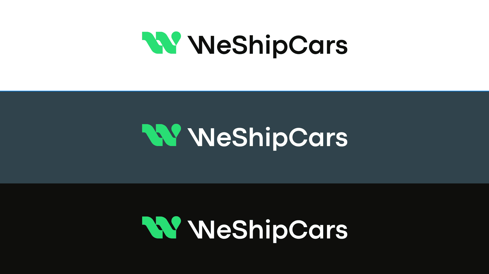
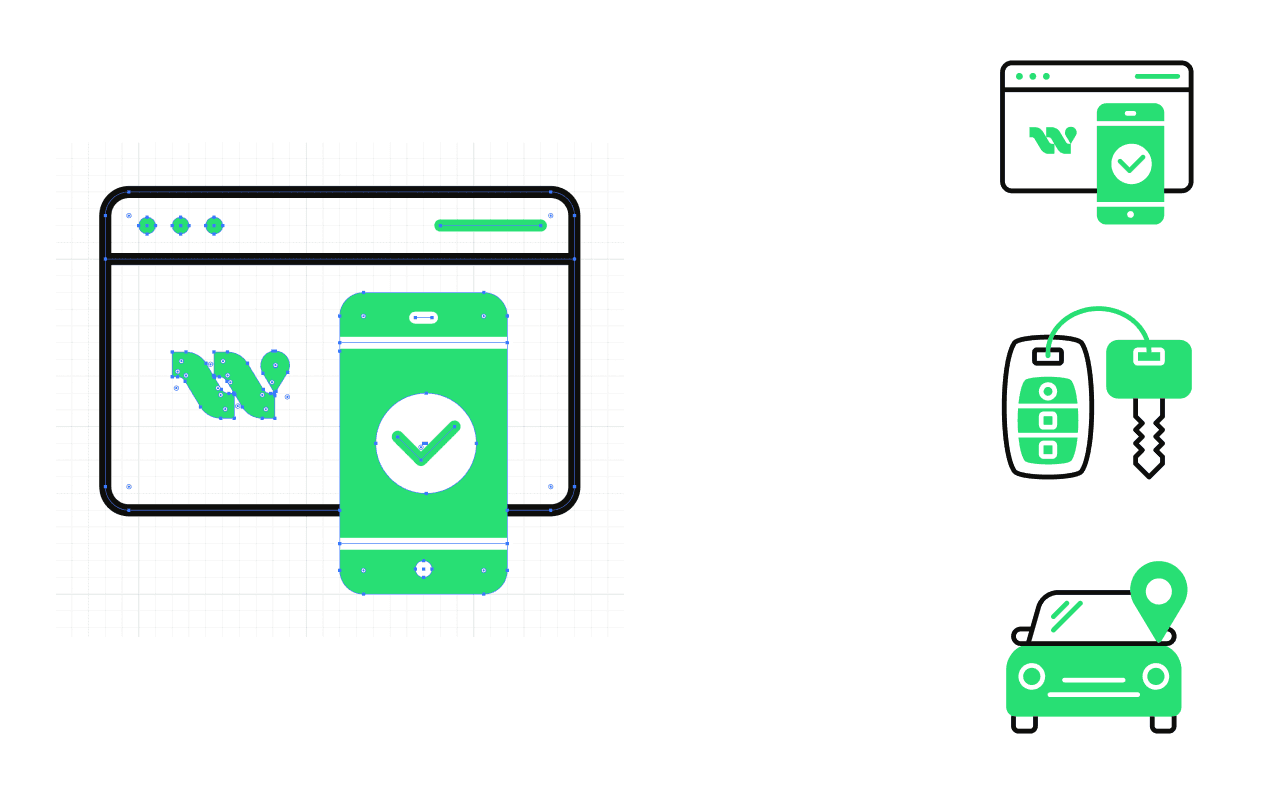
Logo & Core Identity
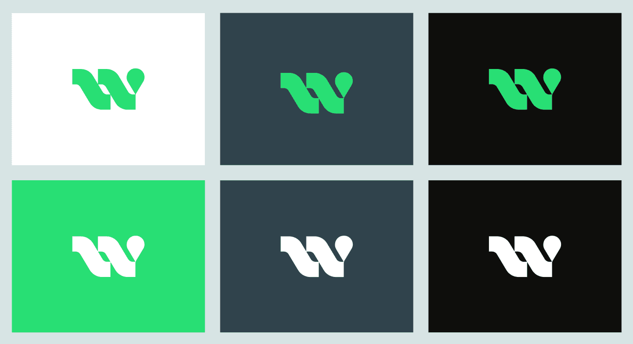
At the center of the identity is a custom logomark built around the letter “W”, directly referencing the brand name. The mark is constructed from flowing, road-like beams that symbolize movement, long-distance transport, and continuous progress.
A subtle location marker is integrated into the form, reinforcing ideas of navigational accuracy, delivery precision, and tracking. The symbol communicates motion without chaos and strength without aggression, allowing it to work across digital interfaces, print, and large-scale applications.
The logo was designed to be distinctive, memorable, and highly scalable, capable of growing alongside the business without losing clarity or recognition.
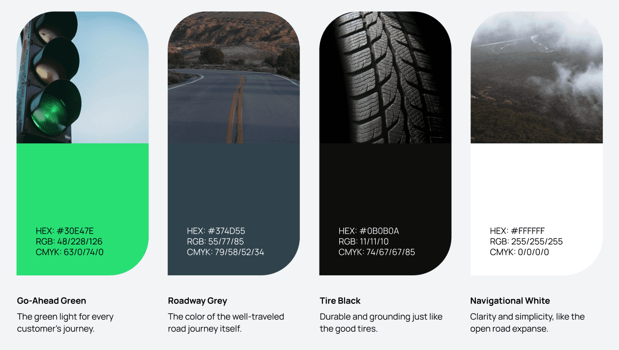
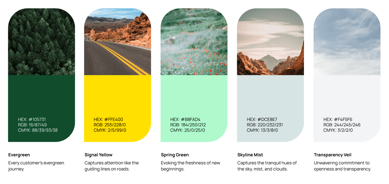
Color, Typography & Visual Language
The color system was designed to balance confidence with transparency. A strong, vibrant green acts as a signal color, representing progress, confirmation, and forward motion. It functions as a visual cue for action and reassurance throughout the digital experience.
This is grounded by deep, durable neutrals inspired by asphalt, tires, and long road journeys, reinforcing reliability and seriousness. Lighter tones are used to introduce openness, clarity, and breathing room, supporting the brand’s commitment to transparency.
Typography plays a critical role in building trust. Bold, confident headlines establish authority and direction, while clean, highly readable body text supports longer explanations without friction. The typographic system was chosen to educate without overwhelming, allowing WeShipCars to explain complex services in a calm and accessible way.
A custom icon set was developed to support navigation, feature explanations, and key reassurance points, all derived from the same geometric and directional logic as the logo.
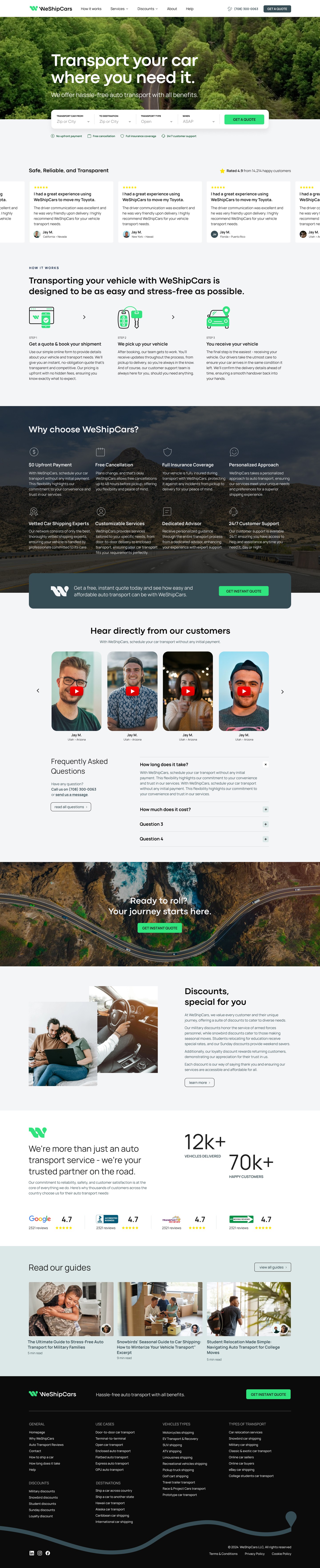
Digital Experience & Web Design
The website was designed as a decision-making tool, not a marketing surface. Every screen, interaction, and content block was structured to reduce uncertainty and guide users toward confident action.
We wireframed the entire booking and quotation experience, mapping all key user flows from first visit to completed request. Particular attention was given to form logic, information hierarchy, and reassurance moments, ensuring users always understand what happens next.
The homepage and core service pages were designed to immediately communicate value, credibility, and ease of use. Clear messaging, strong visual cues, and supportive microcopy work together to simplify a traditionally complex process.
The result is a digital experience that feels calm, controlled, and transparent, even when users are making high-stakes decisions.
Brand Guidelines & System Thinking
To ensure long-term consistency, we created a comprehensive brand guidelines document covering logo usage, color application, typography, iconography, layout principles, and tone of voice.
This system allows internal teams and external partners to apply the brand confidently across new touchpoints without diluting its clarity or intent. The guidelines were designed to be practical and usable, not theoretical, supporting real-world growth and iteration.
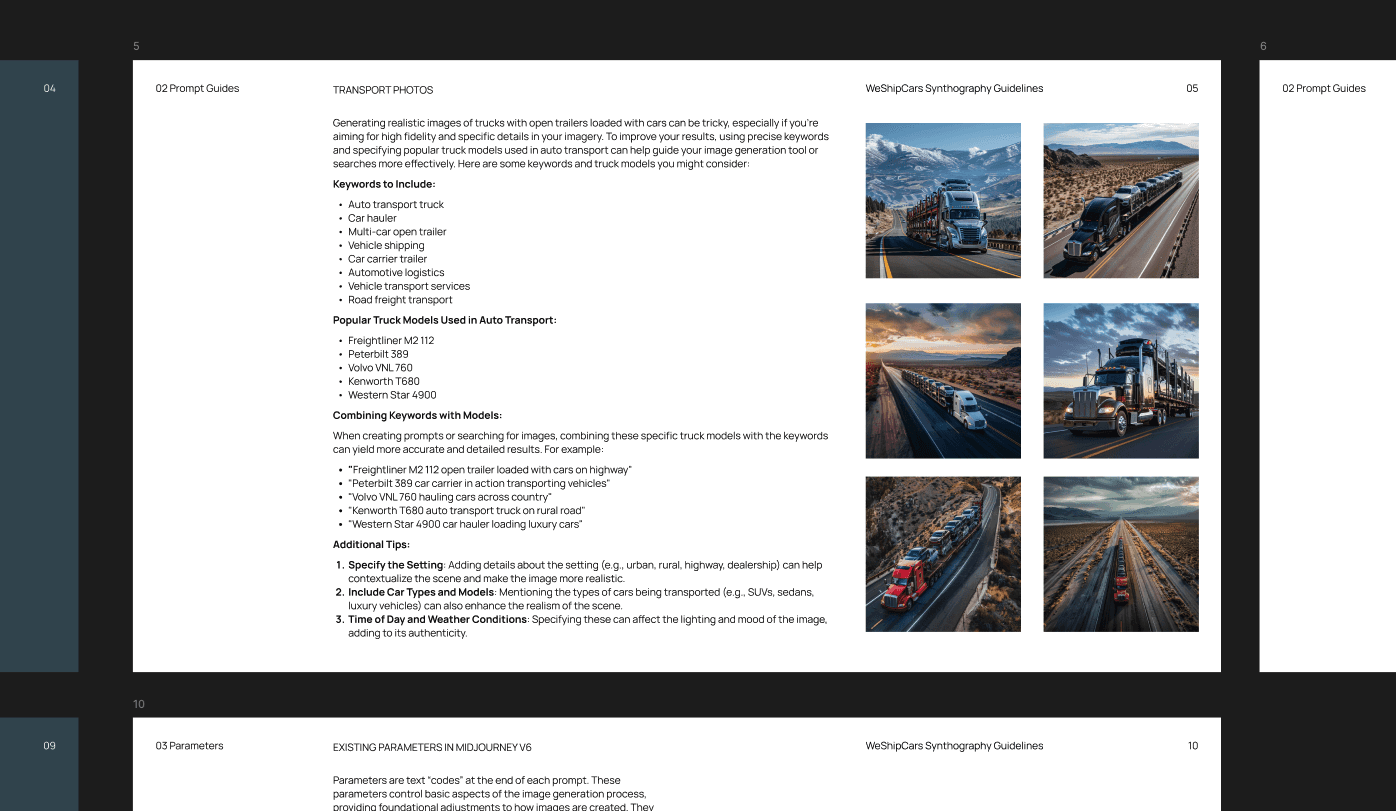
Synthography & Image System
One of the key challenges for WeShipCars was the lack of available, relevant photography for their business. Auto transport is difficult to capture visually, and traditional stock imagery often felt generic or misleading.
To solve this, we curated a collection of free-to-use photography from across the web, aligned with the brand’s visual direction and emotional tone. In parallel, we developed a synthography guidelines document and a custom prompt library for Midjourney.
This system teaches the WeShipCars team how to generate their own on-brand visuals, allowing them to create consistent, flexible imagery without reliance on expensive or limited photo shoots. It empowers the brand to visually scale alongside its services.
The final result is a cohesive brand and digital system that brings clarity, confidence, and trust to a fragmented industry. WeShipCars now presents itself as a modern, customer-first platform that combines expertise with empathy and structure with innovation.
By aligning strategy, identity, and experience, the brand is positioned not only to convert more effectively, but to build long-term loyalty and establish itself as a credible leader in auto transport.
WeShipCars is an example of how thoughtful strategy and design can transform a high-friction service into a clear and reassuring experience. For KICKFLIP, the project reflects our approach to building brands that work under pressure, support real human decisions, and scale with intention rather than noise.
LINKS
Credits
Marietta Todorova — Brand Identity, Graphic Design, Iconography
Martin Bonov — Digital Strategy, UX, Web Design, AI Imagery
Todor Bonev — Web Design, Design System
Explore more work


Work